Group List for Spaces

Company

Wix

Role

Product Designer working with PM, BA, developers, UX writer.

Industry

SaaS

Date

September 2022 - March 2023

I know everyone tries to put only the best and most complex cases in portfolio. But the routine design work is not only building big and complex projects. Mostly we are trying to achieve small wins, but with a huge impact to improve user experience based on user needs. That's why I decided to show you this case.

I know everyone tries to put only the best and most complex cases in portfolio. But the routine design work is not only building big and complex projects. Mostly we are trying to achieve small wins, but with a huge impact to improve user experience based on user needs. That's why I decided to show you this case.

I know everyone tries to put only the best and most complex cases in portfolio. But the routine design work is not only building big and complex projects. Mostly we are trying to achieve small wins, but with a huge impact to improve user experience based on user needs. That's why I decided to show you this case.

Challenge

We always rely on A/B testing when trying to make small improvements. But what kind of problems does this approach have? 


1. Users can't leave feedback if they want.
2. It takes devs time to develop ideas to test.
3. Sometimes tests loose because solution was wrong. And it's difficult to explain why.

Problem

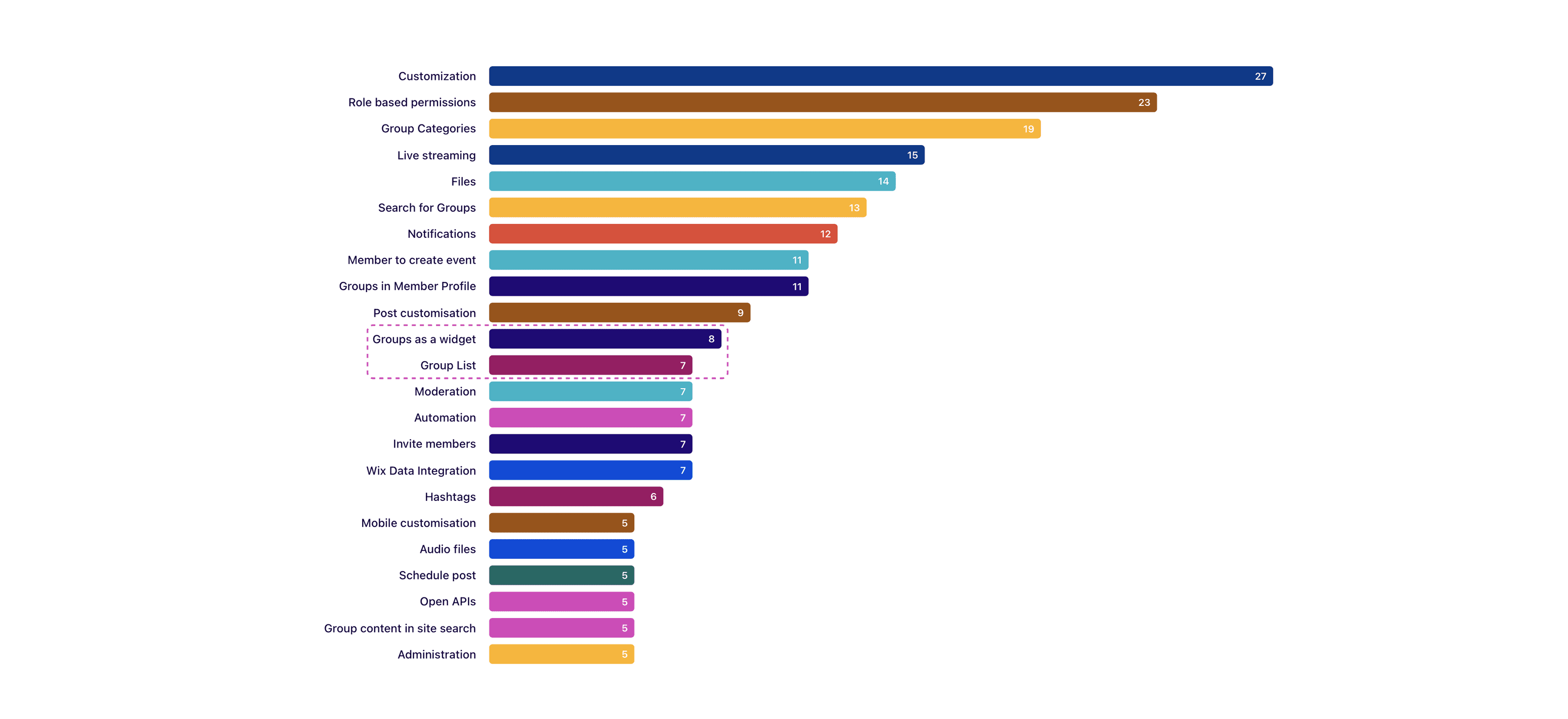
One of the top user requests was related to group list and group widget. During user interviews, 7 group owners were complaining that their users don't understand the difference between groups they joined already and groups they can still join.

Visual design

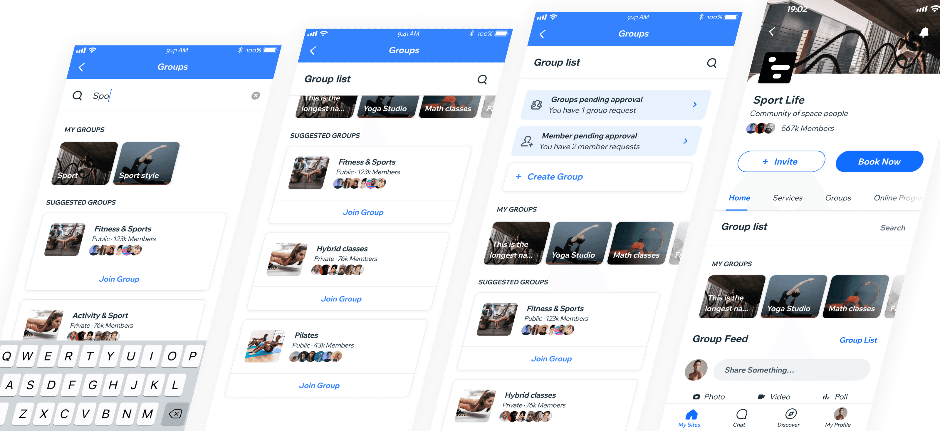
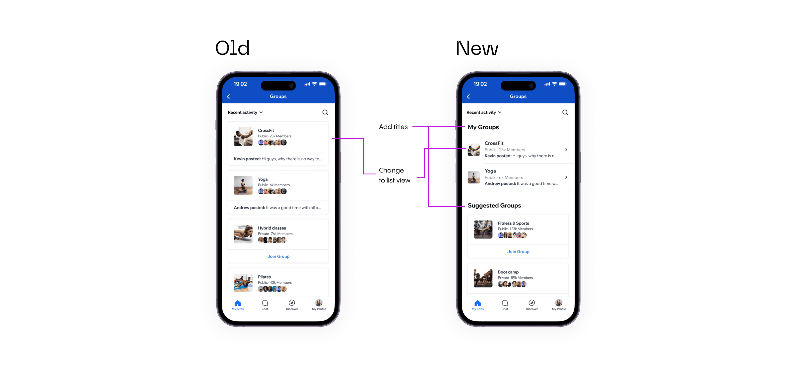
The visual problem was obvious. We had the same design for group cards for both cases. The only difference to understand which group you see on a screen is posted data and button.

I decided to divide all groups visually into 2 separate blocks: "My groups" and "Suggested groups". Also to separate it even more, I changed the look of the cards from different categories.

Validation

To validate my idea:


  • I spent 2 days preparing mockups and prototype in Figma.


  • Before doing design, I asked to provide me with a data set of users who have more than 5 groups created.


  • I spent 1 day preparing a Maze project and send an email to these users asking them to run it. l to these users asking them to run it.

  • And I needed 2 days to wait for responses.

Results

It took one-week sprint to get results:


  • I've sent 221 emails

  • 89 people opened email

  • 38 of them opened test

  • 29 users ran it

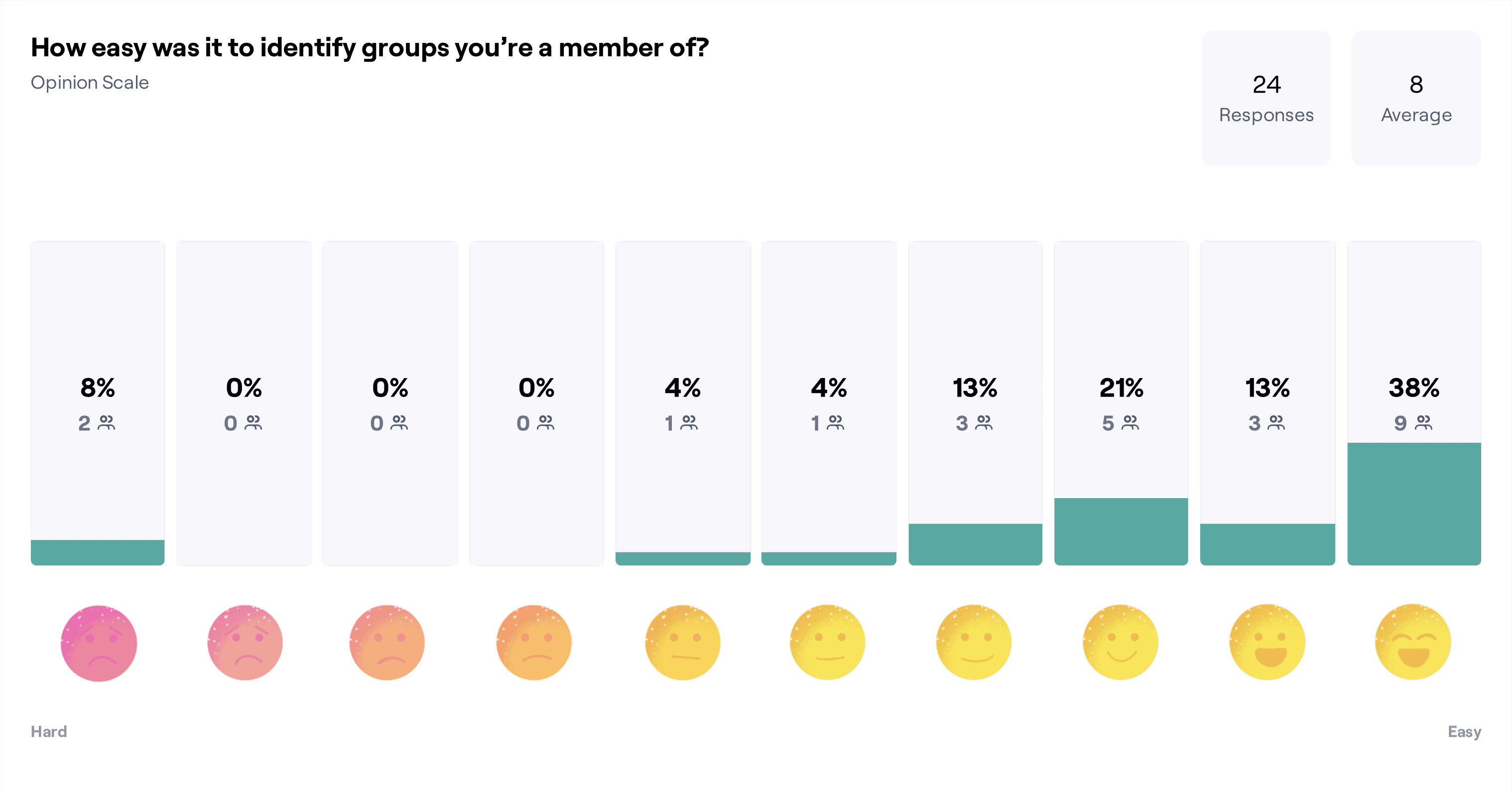
  • I got 24 responses


>10% of the user base finish a test. It was fantastic result and something I didn't expect.

We got some good feedback:


  1. "It was easy to identify which group I was a member of. The groups that are at the top of the feed under "My Groups" is what I have access to. I would prefer it to say Access Your Groups. Maybe that is too long of a title. My Groups will take some time getting used but it's simple enough. Thanks for this survey and I think this will be a wonderful feature to have at the top of the feed rather than the bottom."

  2. "It was straight forward. Once I realised they were not my actual groups. Lol"

But we always have something to improve:


  1. "I think you need a new UI change. Your groups are in a nice bubble or box that when you click it expands otherwise this looks like a word press site which looks very plain and full. The whole wix branded app needs a UI update for sure."

  2. "Maybe a tab that says "You belong to this group""


  1. "I think you need a new UI change. Your groups are in a nice bubble or box that when you click it expands otherwise this looks like a word press site which looks very plain and full. The whole wix branded app needs a UI update for sure."

  2. "Maybe a tab that says "You belong to this group""


  1. "I think you need a new UI change. Your groups are in a nice bubble or box that when you click it expands otherwise this looks like a word press site which looks very plain and full. The whole wix branded app needs a UI update for sure."

  2. "Maybe a tab that says "You belong to this group""

Implementation

With all these results I went to devs and we start thinking about implementation.

My first idea was good, but it took more development time. And team suggested using a group carousel component, which was already developed, instead of a list view.

Product team agreed to give it a try because in this case we can get results sooner and we solve user problem.

Also I got some feedback during design system reviews, finalized design and prepared to delivery:

What's next? 

We've released these updates under A/B test and got very good results:


  • 2% increase in reactions

  • +11.8% posts created

  • -1% decrease in comments. But not significant.

  • 2 % more usage of list widget

We are planning to work with comments team to understand why commenting was dropped and will run a new test soon.